How to Properly Find the Interquartile Range: A Practical Guide for 2025
The **interquartile range (IQR)** is an essential measure in statistics used to assess the spread of data points in a dataset. It provides valuable information about the **statistical dispersion** of data, highlighting the range within which the central 50% of the data points lie. Understanding how to find the IQR is crucial for performing **data analysis**, identifying **outliers**, and interpreting **data distributions** effectively. In this guide, we will explore the concept of IQR, its importance, and step-by-step instructions on how to calculate it.
Understanding the Interquartile Range (IQR)
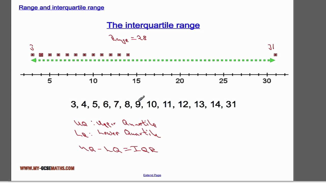
The interquartile range is defined as the difference between the upper quartile (Q3) and the lower quartile (Q1) of a dataset. Quartiles divide a dataset into four equal parts, helping to understand **data variability**. While the **mean** and **median** indicate central tendency, the IQR shows how tightly the data is clustered around the median, making it a significant measure of **statistical range**. A smaller IQR denotes that the data points are closely packed, while a larger IQR indicates greater spread, thereby providing insight into data distribution.
Importance of the IQR in Data Analysis
The IQR plays a vital role in various statistical methods and techniques. By analyzing the IQR, we can effectively summarize and interpret a dataset, allowing us to make informed comparisons. The IQR is particularly useful when comparing two or more datasets, as it reveals their **measures of spread** rather than just their central tendency. Additionally, it is instrumental in identifying outliers, which are data points lying outside the range of Q1 – 1.5(IQR) to Q3 + 1.5(IQR). Understanding the significance of IQR shapes better decision-making in contexts like **performance analysis** and **quantitative analysis**.
Defining Quartiles in Context
Quartiles are the three points that divide a dataset into four equal parts. The upper quartile (Q3) represents the median of the upper half of the dataset, while the lower quartile (Q1) represents the median of the lower half. The significance of the interquartile range becomes apparent as it showcases the **spread** of these quartiles. In practical applications, such as creating a **box plot**, quartiles are pivotal in visually summarizing the data and illustrating data variability. Proper understanding and interpretation of quartiles lead to effective data summarization and comprehensive statistical insights.
Calculating the Interquartile Range
Calculating the interquartile range is straightforward but requires accurate data organization. Here, I will detail the steps for a successful **IQR calculation**.
Step-by-Step IQR Calculation
To find the IQR, follow these steps:
- **Organize your dataset:** Start by arranging your data points in ascending order.
- **Calculate Q1:** Identify the lower quartile (Q1) by finding the median of the first half of the data.
- **Calculate Q3:** Find the upper quartile (Q3) by determining the median of the second half of the data.
- **Compute the IQR:** Use the formula IQR = Q3 – Q1 to get the interquartile range.
This method ensures systematic **data organization** and clear calculations while reducing the potential risk of errors in **statistical analysis**.
Example of IQR Calculation
Let’s consider a dataset: {3, 7, 8, 12, 14, 17, 18}. First, organize the data (already done), then find Q1 and Q3:
- **Q1:** The median of {3, 7, 8} is 7.
- **Q3:** The median of {12, 14, 17, 18} is 17.
Finally, calculate the IQR:
IQR = Q3 – Q1 = 17 – 7 = 10. This IQR indicates the spread of the middle 50% of data points, also offering insight into potential outliers.
Visualizing the Interquartile Range with Box Plots
Box plots, also known as **box-and-whisker plots**, are an excellent way to visualize the IQR and overall data distribution. They provide a visual summary of the central tendency, **measures of variability**, and potential outliers within the dataset.
Interpreting Box Plots
In a box plot, the lower and upper edges of the box represent Q1 and Q3, respectively, while the line inside the box shows the median. The whiskers extend to the smallest and largest observations that are not considered outliers, which are plotted as individual points. The clear visualization of the IQR helps in comparing **data distributions** among different datasets, making it easier to perceive differences in spread and medians quickly.
Examples of Using Box Plots for IQR Visualization
Using box plots enables us to compare multiple datasets effectively. Suppose we have two datasets: Dataset A: {5, 7, 9, 10, 12} and Dataset B: {1, 4, 5, 7, 13}. By plotting these datasets on a box plot, we can visual compare their quartiles and see where most of the data points lie. If Dataset A shows a smaller IQR than Dataset B, it indicates that Dataset A’s values are more concentrated where as Dataset B is more spread out, offering insights into variability and suggesting further examination if differences are significant.
Conclusion
Understanding how to **find the interquartile range** is a vital aspect of **statistical analysis** and data interpretation. The IQR helps uncover the true essence of any dataset, emphasising both its variability and potential outliers. Whether conducting a simple analysis or more complex statistical methods, the knowledge of calculating and visualizing the IQR grants you the ability to better understand and interpret data distributions. Use this guide to improve your skills and practices in **data analysis**, ensuring more effective decision-making across various applications.
FAQ
1. What is the difference between IQR and range?
The range is the difference between the maximum and minimum values of a dataset, while the IQR measures the middle 50% of data points. The **IQR** provides a better understanding of data dispersion as it is not influenced by extreme values or outliers, which can skew the range measurement.
2. How do I identify outliers using the IQR?
Outliers can be identified by calculating the IQR and determining the fences beyond which values are considered outliers. Specifically, any data point below (Q1 – 1.5 * IQR) or above (Q3 + 1.5 * IQR) is considered an outlier. This method ensures a systematic approach to identifying anomalous data points.
3. Is the IQR used in all types of data analysis?
The IQR is widely used in **descriptive statistics** and various forms of data analysis, especially during exploratory data analysis, as it gives a clear measure of data variability. However, in some analyses where datasets may not be normally distributed, other measures of dispersion may be favored.
4. Can IQR be used with non-numeric data?
In general, IQR is applicable only to numeric data. For categorical or non-numeric data, measures like the mode or frequency counts are more appropriate for understanding data distributions, as IQR’s concept is grounded in sorting and ranking numerical values.
5. How does sample size affect the IQR?
Sample size can significantly affect the IQR. In smaller datasets, the calculated quartiles may have a larger variability due to fewer data points, which can result in less reliable IQR. As sample size grows, the IQR typically stabilizes, leading to a more accurate portrayal of the data’s dispersion, improving the overall clarity of statistical summaries.